
Trane UK hire out temperature control equipment through a site structured around two things at once: how urgently somebody needs the kit, and which industry they're in. It was delivered alongside the client's own brand team and a separate search agency.
Facilities managers arrive because something has already failed. Someone planning a purchase wants specification and lead times. Someone with a dead chiller wants a phone number and evidence that a person will answer it. The same pages have to do both.

The information architecture runs on two axes at once, equipment and market, over a single page skeleton, taken from wireframes to hi-fi with the structure proven in greyscale before anyone chose a colour. The component and template systems were built to stretch into markets the company hadn't launched in yet, ahead of a planned EU rollout.
The argument that mattered was about page count. The client wanted a landing page for every equipment type in every market, twenty pages, good for long-tail search and bad for anyone actually reading them. I wanted nine. What shipped was the compromise: Solutions absorbed the equipment terms and Markets absorbed the sector terms, and it's better than either of us proposed alone. My version protected the reading experience and gave up more search surface than the business could afford. Theirs protected the surface and would have produced twenty pages nobody finished.
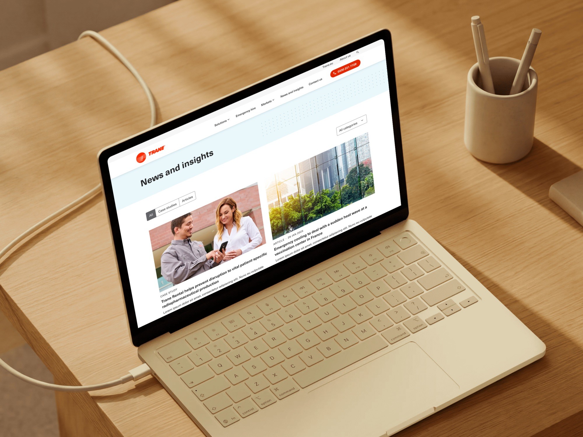
The site produced over £100,000 in sales within a few months, with users enquiring about products beyond the original rental focus. The client attributes that primarily to search rather than to design, and no baseline exists to argue otherwise.