
Another agency delivered a new identity that had to go live across an entire charity site for a national campaign. There was no research phase and no time for one, so accessibility became the constraint that shaped the work.
A brand book gives you a palette and a few hero layouts. It doesn't tell you what the yellow does behind 14px body text, on a disabled button, or on a form error. Those states had to be resolved across donation, lottery and shop, to a fixed date, for a 24/7 air ambulance service that treated 1,907 patients in 2024.
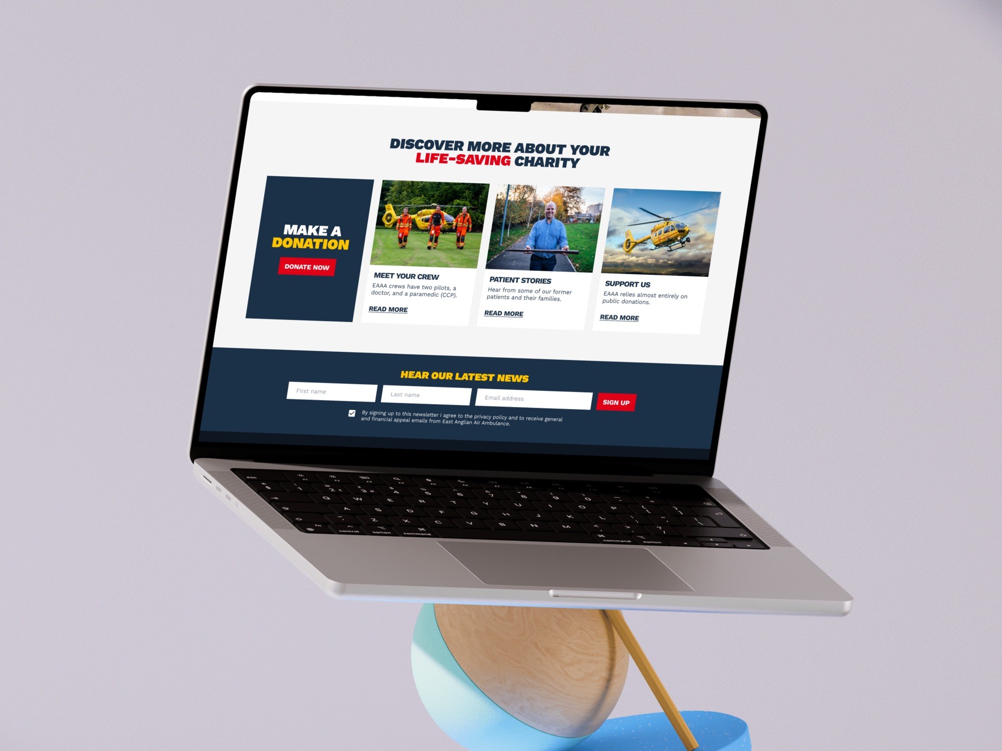
I ran an accessibility audit, testing the palette against WCAG at the sizes things actually render, and found the brand yellow scores 1.56:1 on white, failing every threshold. This is a site whose navigation carries a text-resize control, so it had already declared who its readers are, long before anyone opened a brand guideline. Yellow got restricted to display sizes, with a darkened amber standing in for anything small, documented at component level so the charity's own team could keep applying it after handover.
The brand agency read the amber as breaking their palette. What settled it wasn't the contrast ratio alone. It was showing them the states nobody had drawn: the disabled button, the form error, 14px body copy inside the donation flow. They'd never been asked about any of those, so there'd been nothing to disagree with until they saw them.

Shipped on schedule for a national campaign, with the resize control and contrast ratios intact through a full rebrand.