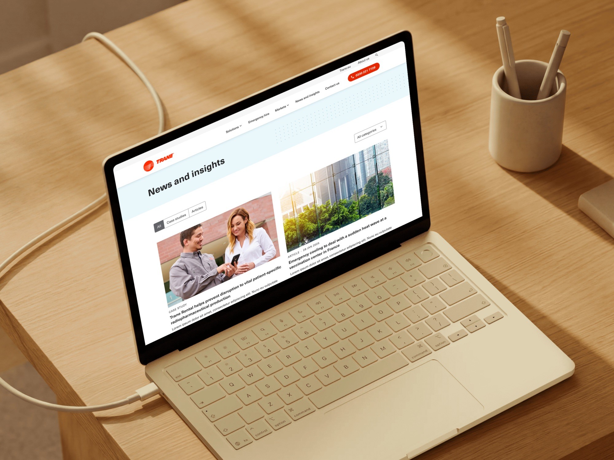
Trane UK
Trane UK hires out cooling and heating equipment, often to someone whose building has just failed. As Lead Product Designer I shaped the rental site's structure and interface, alongside Trane's brand team and a separate search agency.
The situation
The buyer whose building is too hot
A facilities manager planning ahead wants specifications and lead times. One whose chiller failed this morning wants a phone number and proof that someone will answer. The same pages had to do both.
Has a summer event and a shutdown coming. Wants specifications, lead times and something to compare.
Needs a number and proof a person will pick it up. He will not read a specification sheet today.
Who was in the room
Three teams, one site
I joined after discovery, so my first job was reconciling research I hadn't run.
Trane's brand team held the identity, a search agency held SEO and paid, and Filter had UX, UI and build. I owned the structure and the interface.
Trane brand team
Held the global identity, which the rental site had to carry.
Search agency
Held SEO and paid search, and proposed the landing-page plan.
Filter
UX, UI and build. I owned the structure and the interface, from wireframe to handoff.
The disagreement
Twenty pages or nine
The search agency wanted a landing page for every equipment type in every market, and the client backed them. That catches long-tail searches. It also makes twenty near-identical pages, each competing for the same terms. I wanted fewer pages with more in them.
Every equipment type in every market. Good for long-tail search, and twenty near-identical pages competing for the same terms.
Solutions takes the equipment search terms, Markets takes the sector terms, and every page has a reason to exist.
Decision
One skeleton, two routes in
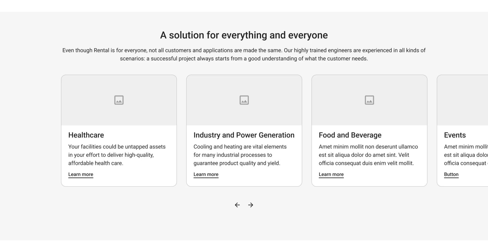
We met in the middle. Solutions runs equipment-first and takes the equipment terms, Markets runs sector-first and takes the sector terms, and one page skeleton serves both.
A buyer who knows they need a chiller and one who knows they run a hospital reach the same equipment by different routes.
The wireframes
The phone number was in the first wireframe
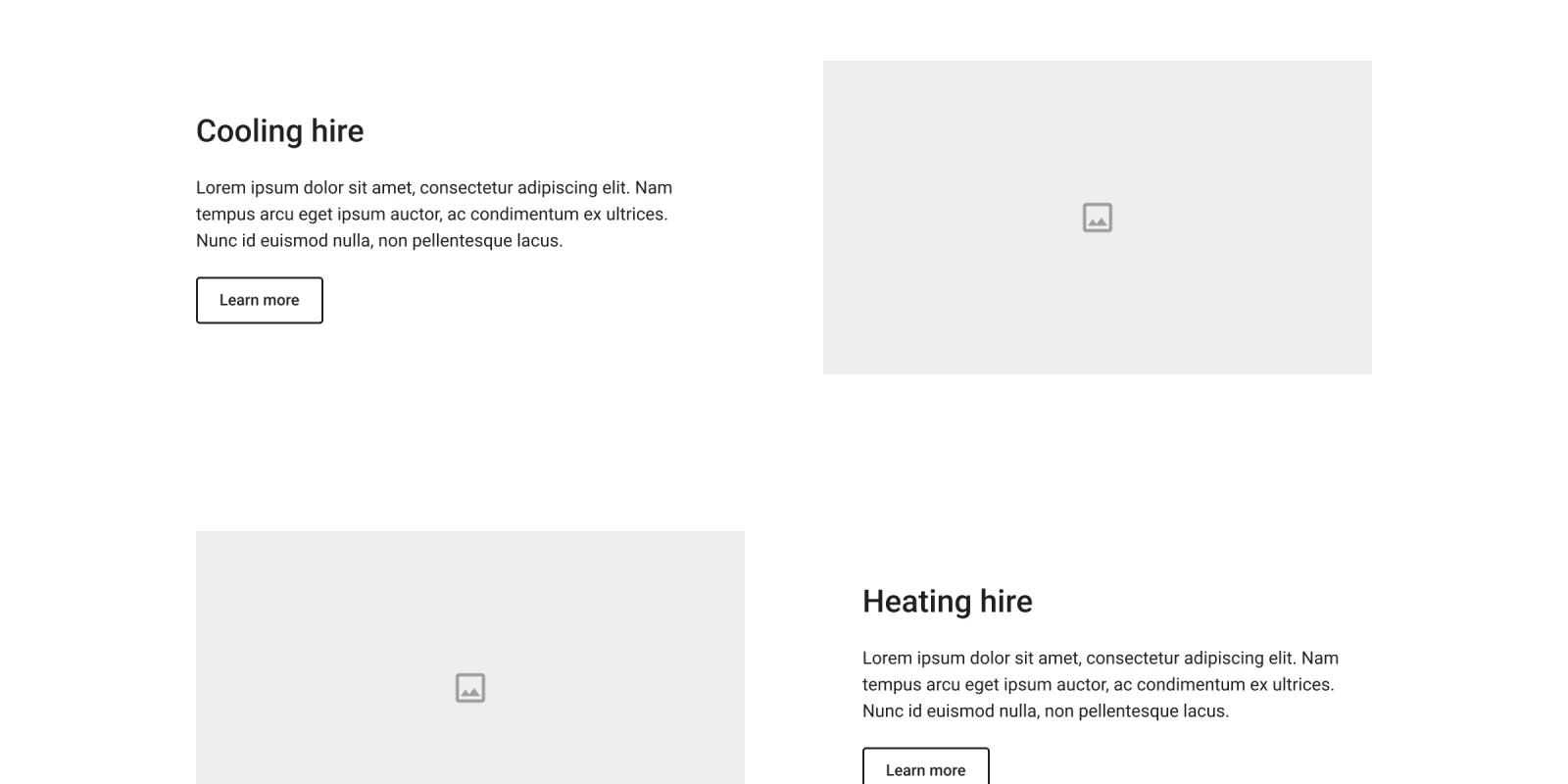
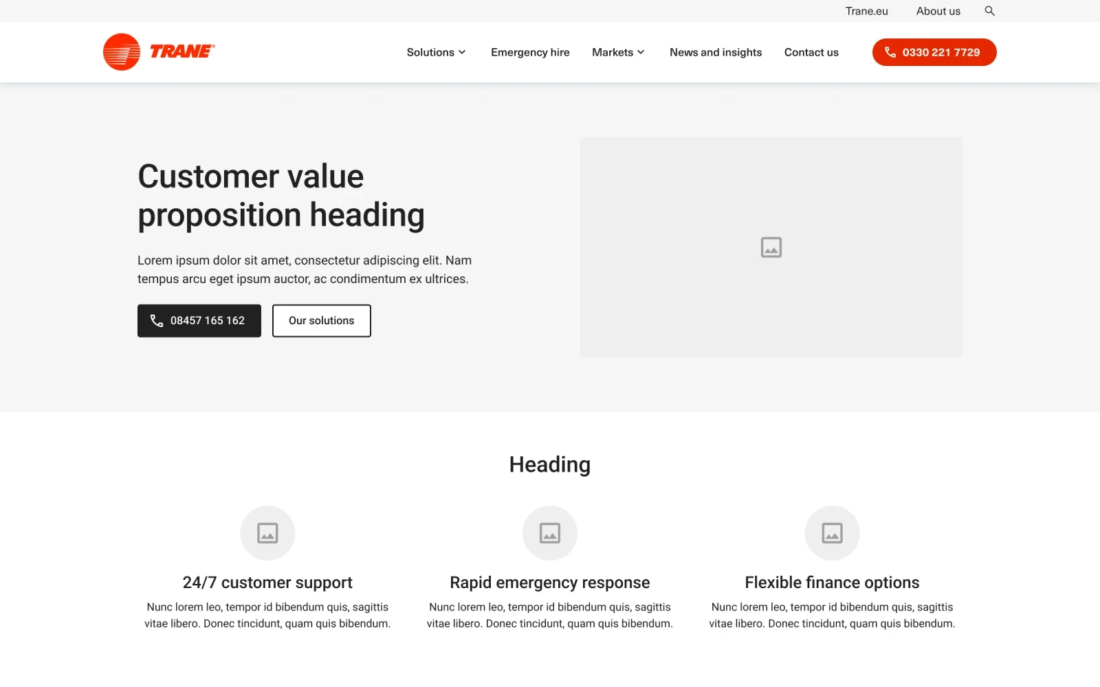
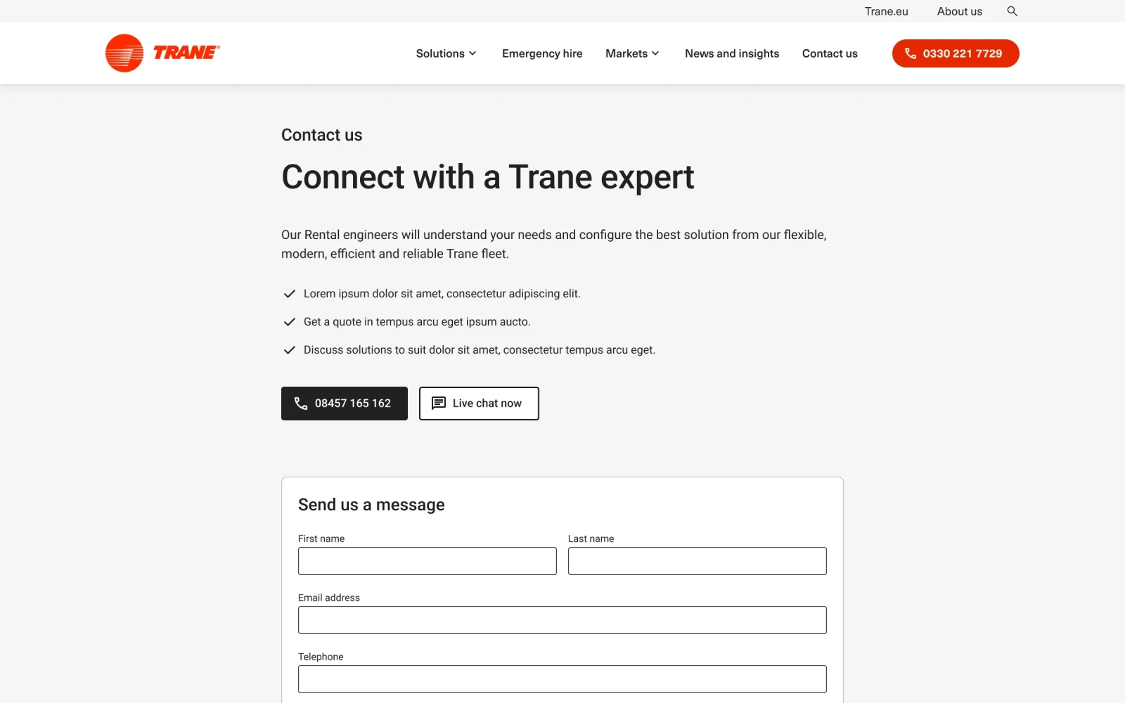
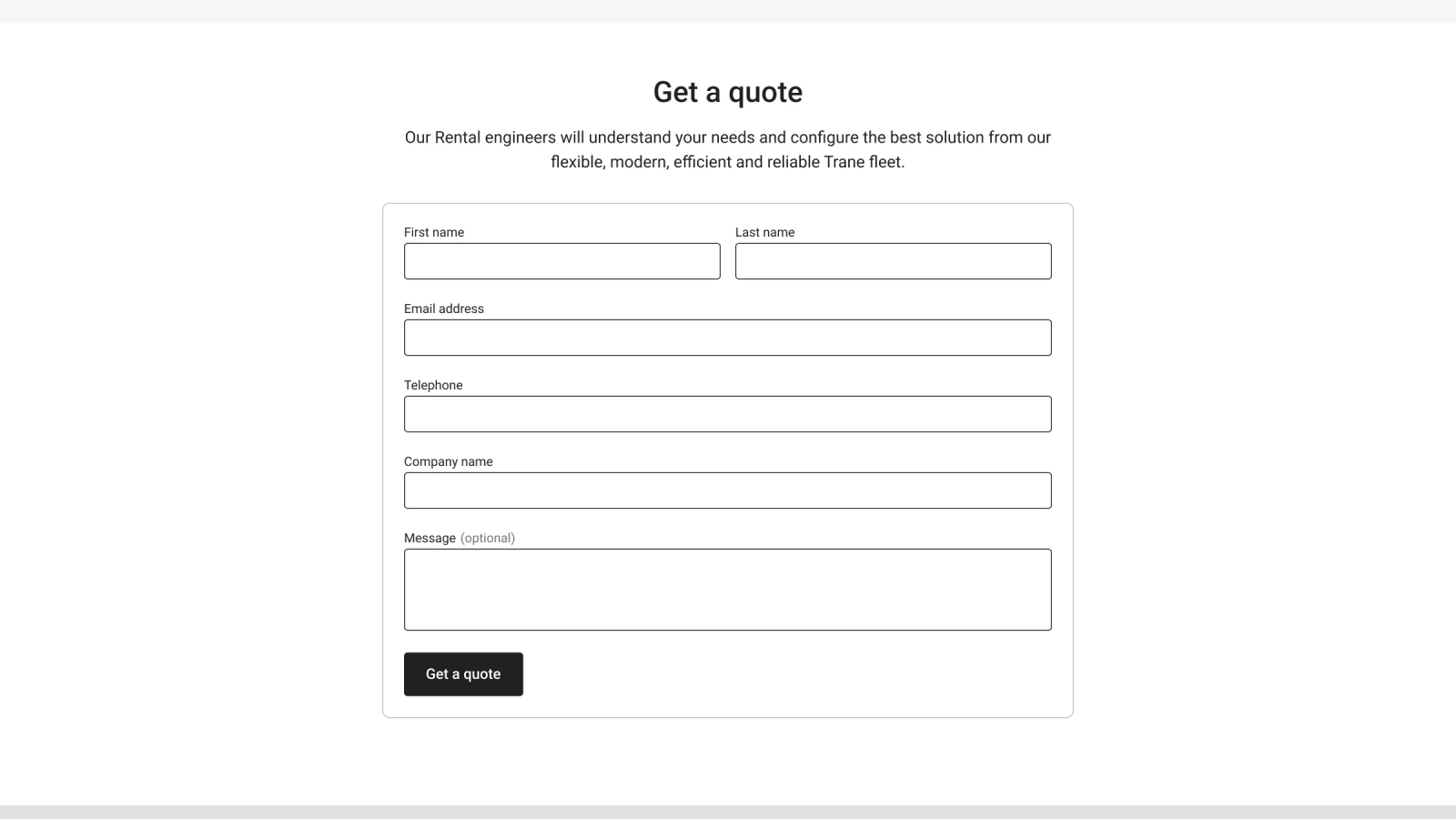
Every wireframe has a phone number in the navigation and a call button first in the hero, before any visual design existed.
A contact button added at the visual stage is usually a marketing request. One in the first wireframe says who the page is for.
Emergency hire
A shorter page for a worse day
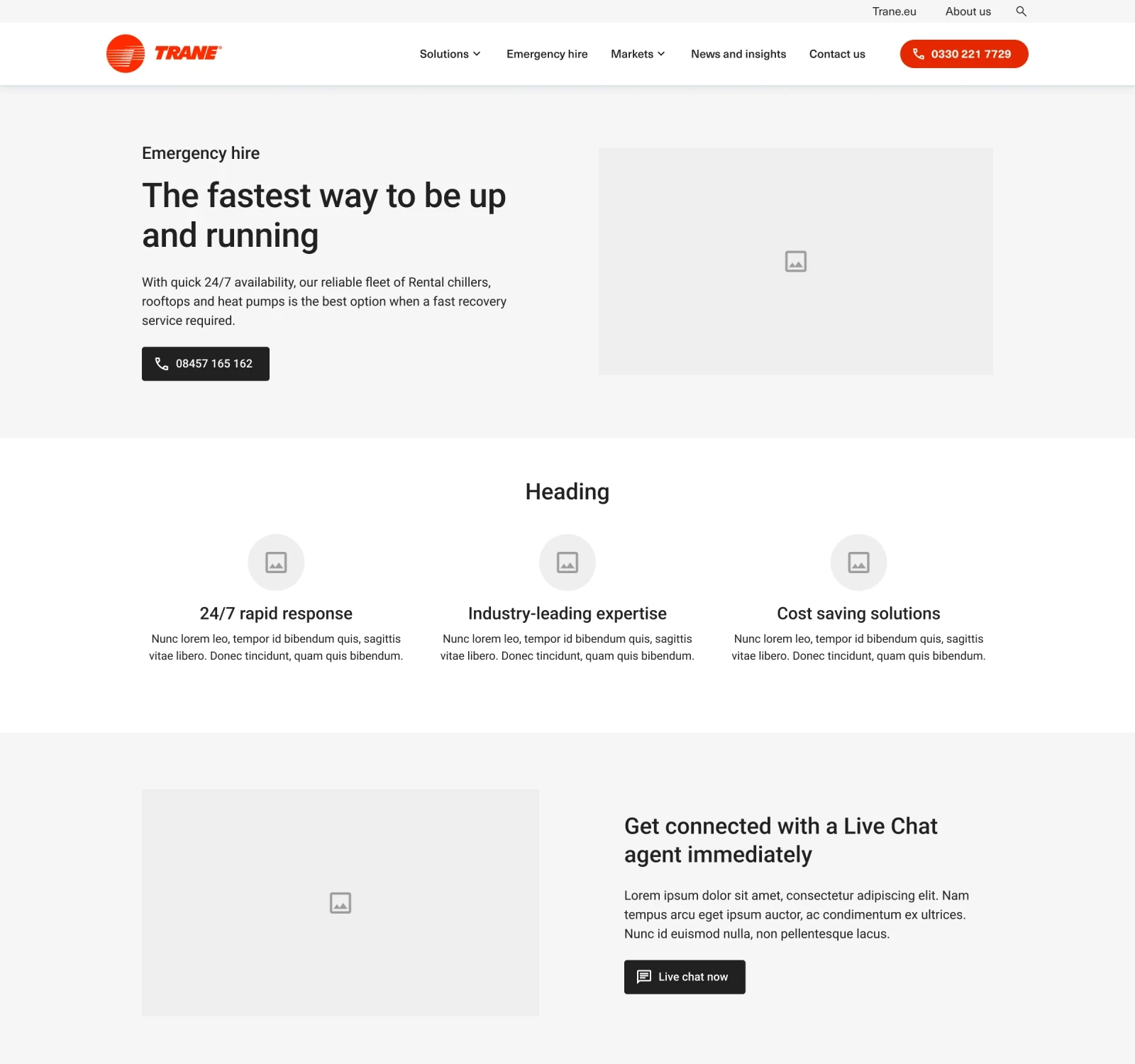
Emergency hire got its own place in the main navigation and its own page.
It is shorter than the rest, with the number first and live chat second.

Learnings
What I'd do differently
Let the two routes meet. A single listing filtered by equipment and by sector would have served the hospital engineer who needs a chiller better than two parallel trees.
Make the emergency page even shorter. Three lines and a number would serve someone whose plant has just failed.
Settle the page count before the first wireframe. Framing it as the buyer's two routes from the start would have saved a round of argument.
Where it is now
Over £100k in a few months
Filter published over £100k in sales within a few months of launch, with buyers enquiring about Trane products beyond rental. There was no baseline, and Filter put it down mainly to search. What the structure can claim is the cross-selling: people who came for rental and asked about other Trane products. The UK rental site has since moved onto Trane's European site, and the rental number in its top bar is the one from the first wireframe.