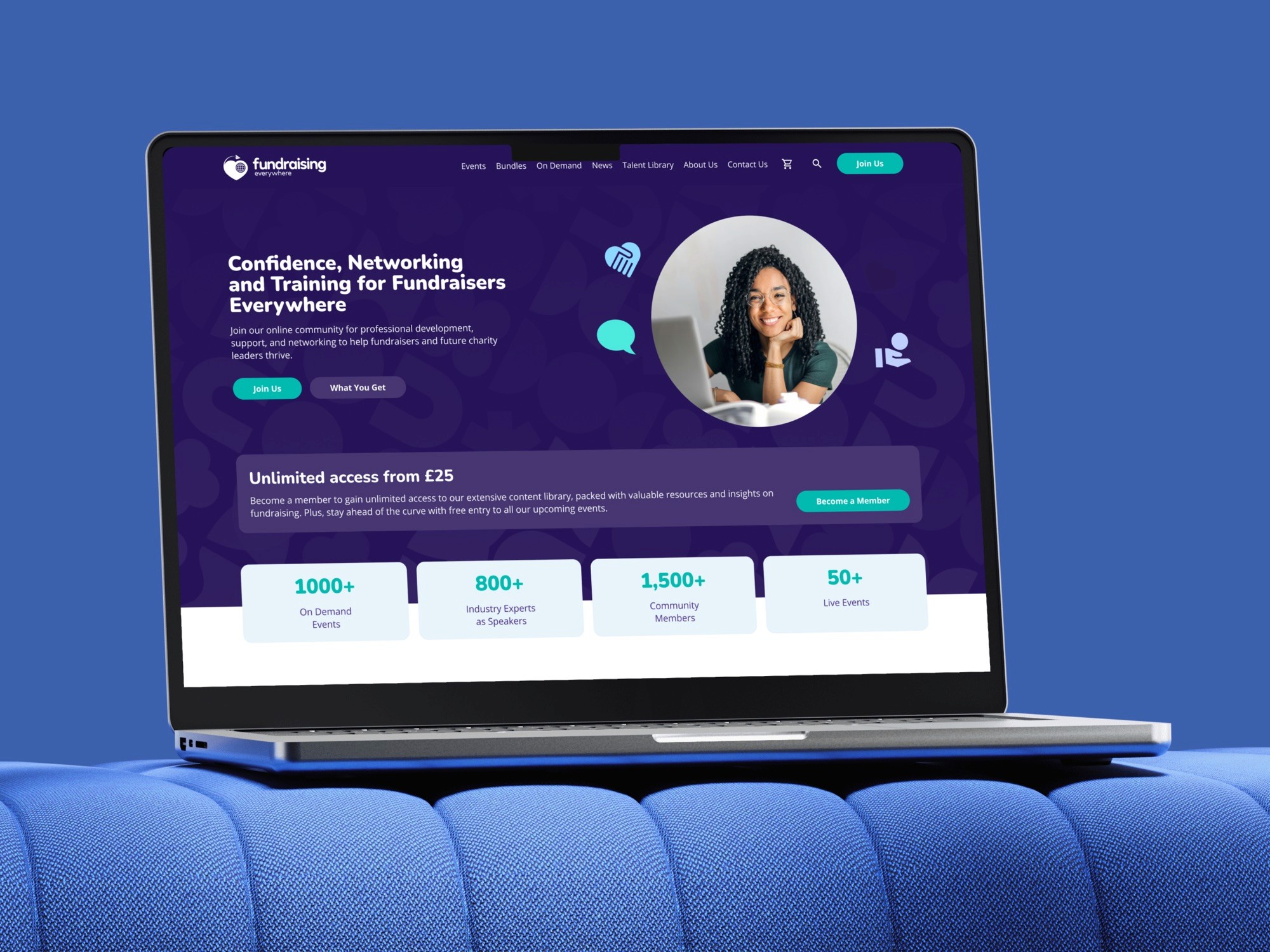
Fundraising Everywhere
Fundraising Everywhere sells training to charity fundraisers in two ways: membership at £25 a month, or a ticket for a single event. As Lead Product Designer I reworked the three pages where money changes hands: the product page, the basket and checkout.
The situation
The membership buyer had the longer route
The brief said the site worked for both ticket and membership sales but wasn't converting as well as it could. I mapped both buying journeys side by side.
Both took six steps. A ticket buyer went straight from the product page to the basket. A membership buyer had to leave the product page for a separate landing page and start again, so the higher-value customer was the one asked to change course halfway through.
Event ticket
Home, product page, basket, checkout, order, account.
Membership
Home, product page, membership landing page, sign up, order, account.
Decision
Three pages and four gaps
The client had just said the site works, so I kept the scope to the three pages where money changes hands. KPIs for page performance, engagement and conversion were agreed before any design started.
The brief's persona, a fundraising manager at a small foundation, finds an event and then has to convince her boss to pay for it. That one line became a "Share order with manager" option.
Product recommendations
Cross-sell further events from the one being bought.
Membership offer
Up-sell membership from a single ticket.
Customer validation
Confidence in the basket before paying.
Share order with manager
For the person who is not the one paying.
Events and library
Live conferences, then a library on demand
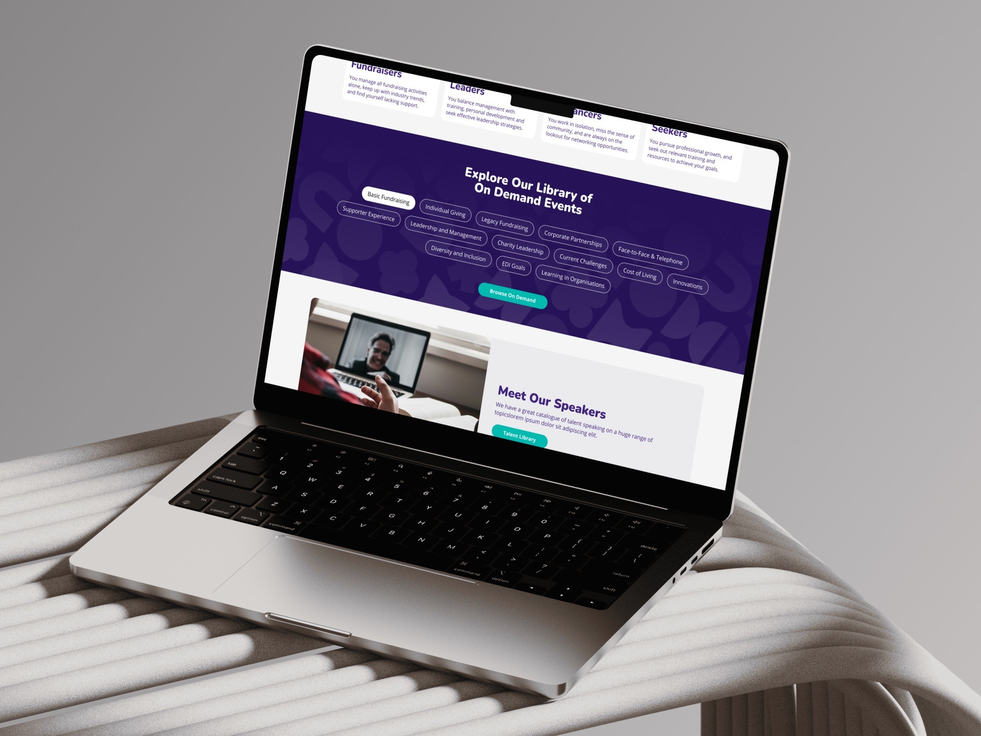
Fundraising Everywhere runs live virtual conferences and keeps the sessions in an on-demand library. The library is browsed by fourteen topic tags rather than a hierarchy, because the same subject comes back across formats and years.
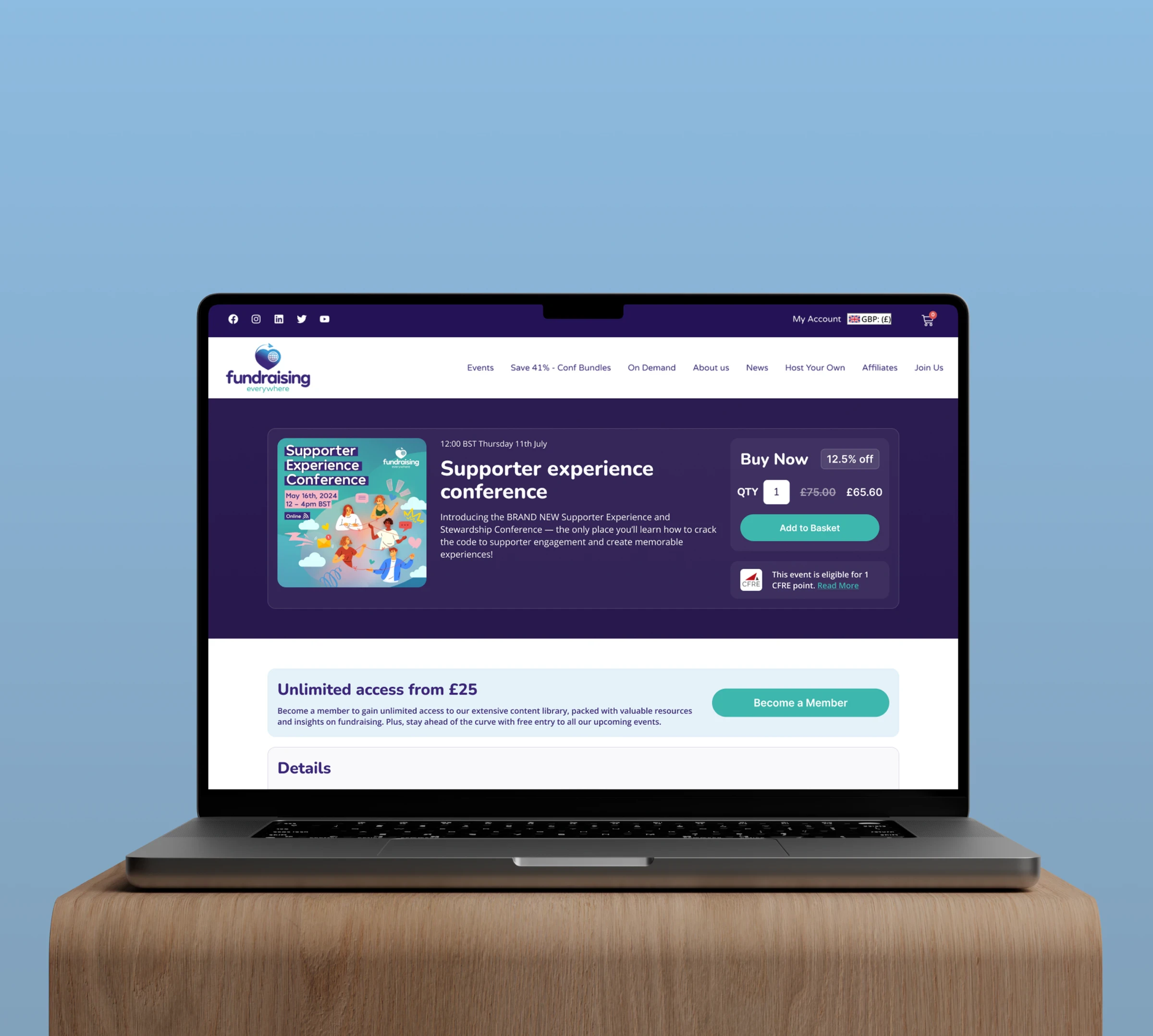
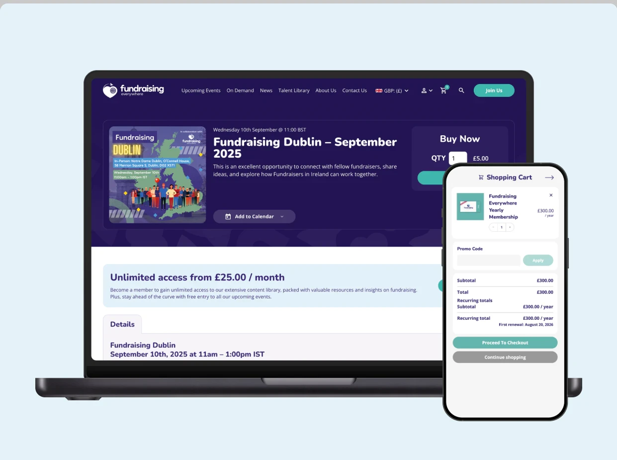
Each event page has its own buy box: the original price struck through beside the discounted one, and the CFRE accreditation points that turn a training purchase into something a fundraiser can expense.
Membership
The offer on every page
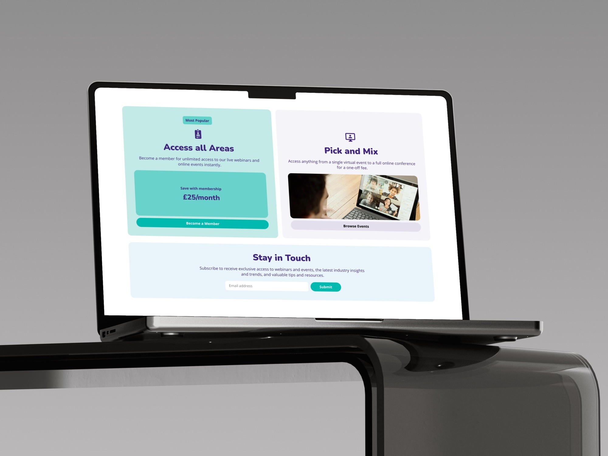
The two plans are weighted on purpose. Access all Areas at £25 a month gets the Most Popular badge, a filled card and the price, while Pick and Mix sits in a paler card. The same "Unlimited access from £25" band repeats on the homepage, the listings and every event page.
In the basket, a checkbox upgrades a single ticket to annual membership, with the one-off price still on screen. A ticket price next to a year of everything is a comparison people can make at a glance.
Handoff
A confirmation that only promises what's true
WooCommerce takes the order and Salesforce holds the membership, with a sync between them. At the moment someone ticks the upgrade and pays, their membership doesn't exist yet.
So the success screen talks about the order, and the access follows. "Welcome, you're a member" would have sent new members straight to a locked page and into a support ticket.
Where it is now
Phase one first, on the live platform
The checkout work went onto the platform that was already live, so a membership business never went dark for a rebuild. The platform upgrade followed as phase two.
