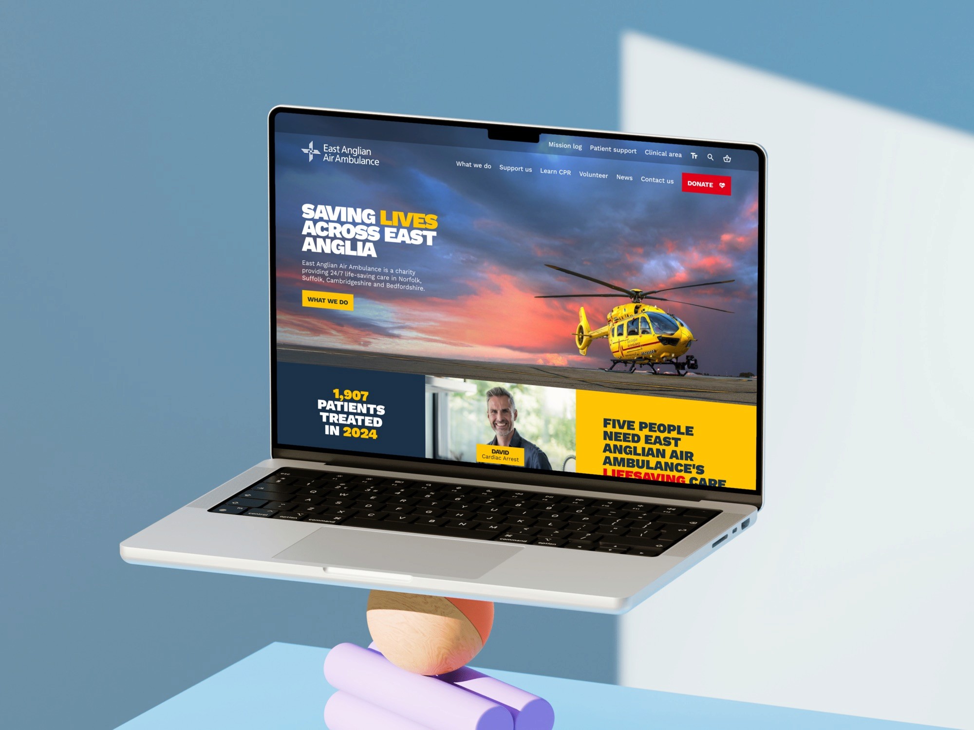
East Anglian Air Ambulance
Another studio's new identity had to go live across the whole site for a national campaign, with no research phase. As Lead Product Designer I applied it across donation, lottery and shop, and accessibility became the constraint that shaped the work.
The situation
A new brand, no discovery, fixed date
A brand agency delivered the identity. It had to go live across every page in time for a national campaign, and there was no time for research.
So before changing anything, I wrote down three things that wouldn't change.
The structure stays
Moving pages while restyling them breaks search rankings and habits at once, and nobody can tell which caused a drop.
Accessibility doesn't go backwards
A new palette is the most common way a rebrand quietly makes a site worse for the people using it.
Donating stays one step away
From every page, including four levels deep in the lottery.
Who reads it
The site had already said who reads it
The utility navigation carried a text-resize control. Sites don't ship one by accident: former patients, their families and older supporters read this one.
That made contrast the first question for the new palette, before layout or imagery.
The audit
Every pairing, checked before applying
I checked every colour pairing the guidelines allowed against WCAG, size by size, before applying anything. The brand yellow fails on white at every size.
Colours sampled from the final homepage design. Ratios are worked out from the hex values using the WCAG 2 formula.
Decision
Yellow as a background, never small text
Yellow became a background for navy text, or display type on navy, and the red donate button keeps white text.
The brand agency read that as breaking their palette. What settled it: their guidelines never covered 14px text, so somebody had to decide it, and yellow at display size is exactly the yellow they designed.
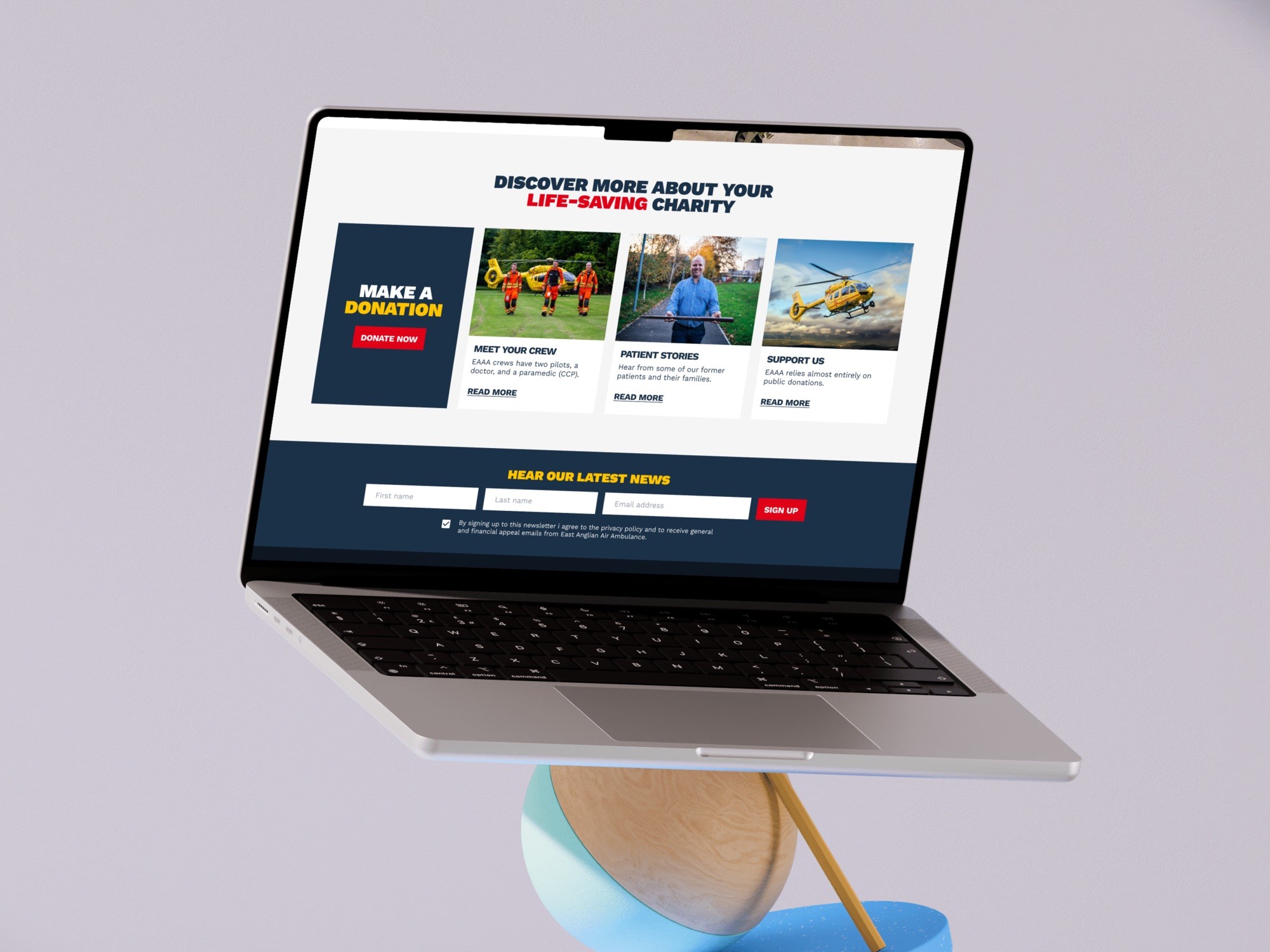
Where the guidelines ran out
Selected, focused, wrong
A brand book has a palette and a logo. It doesn't say how someone knows which donation amount they picked, or what a form field looks like when it's wrong.
I worked those states out across donation, lottery and shop, and sent them back to the brand agency with the rest.

Learnings
What I'd do differently
Agree one number before starting. Homepage donation conversion, a fortnight either side, would have made this defensible as well as describable.
Ask the brand book the questions it never covered, early. Small text, disabled states and errors are brand decisions whether anyone makes them on purpose or not.
Protect what the site already knows. Keeping the resize control and the two-tier navigation was a decision, even though it looks like doing nothing.
Where it is now
Live since January 2026, on schedule
It launched on schedule for the campaign, with the structure and contrast intact. There's no measurement and no client quote. The site has changed since: the resize control has made way for an accessibility toolbar.
