Children with Cancer UK
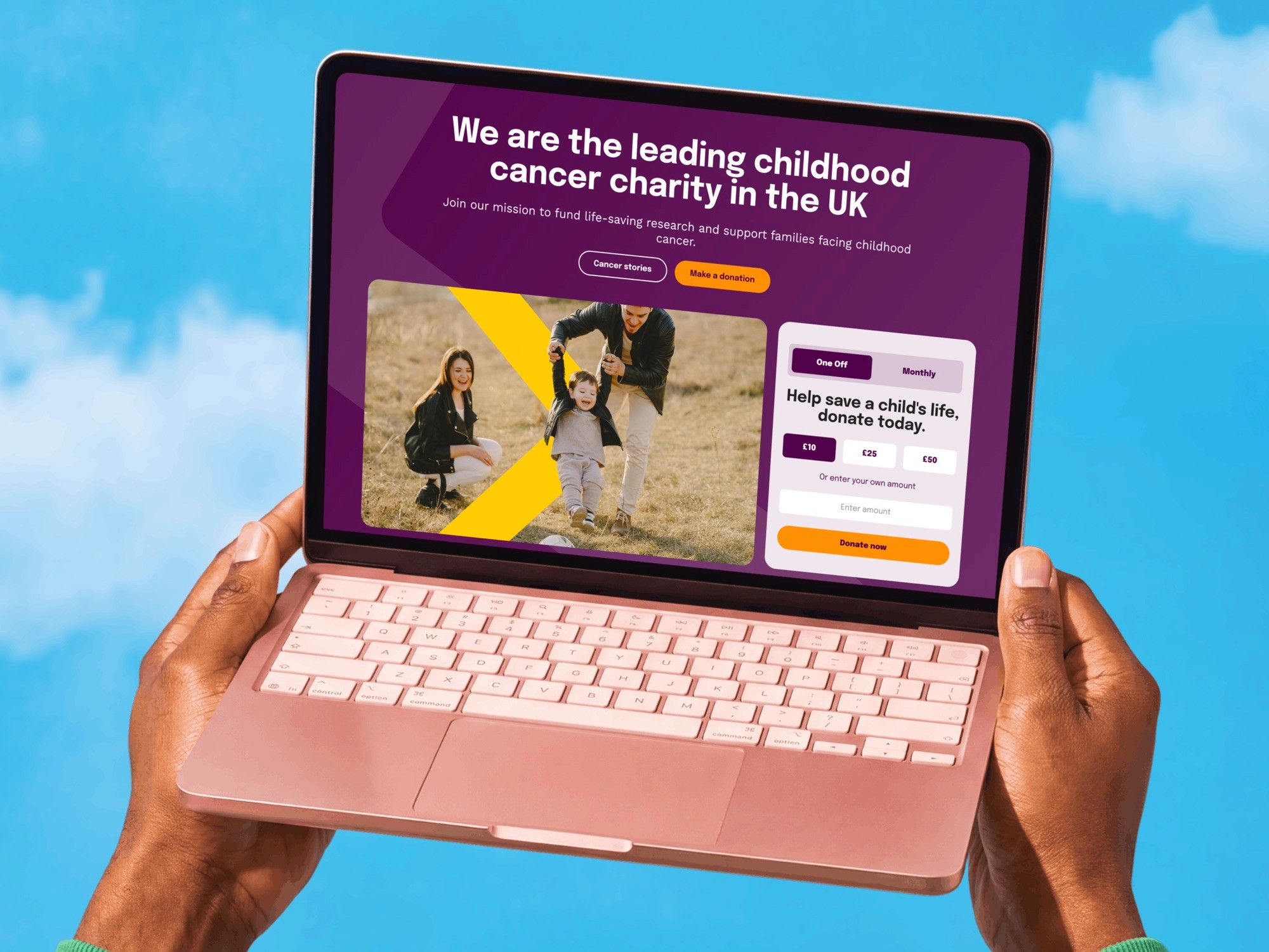
Children with Cancer UK raises money three ways: donations, a shop, and a lottery and raffle. As Lead Product Designer I designed all three on one platform, and ran the discovery workshop that decided what the gaming sites had to do first.
The situation
Three ways to give, three different people
A gift, a purchase and a raffle entry are three legal registers, and three different people arrive at them. All three now run on one WordPress multisite with Salesforce behind it, so a donor, a customer and a player are the same supporter.
Needs practical help today. She is not here to give money.
Knows why he plays. Wants the price, the prizes and the draw date.
Wants event listings, materials and a way to bring friends in.
How I ran discovery
Five activities, one board each
For the lottery and raffle sites I built a FigJam workshop and ran it remotely with six people from the charity's digital, lottery, marketing and fundraising teams.
Each person had their own sticky-note colour, so afterwards you could see whether a shared priority came from one person.
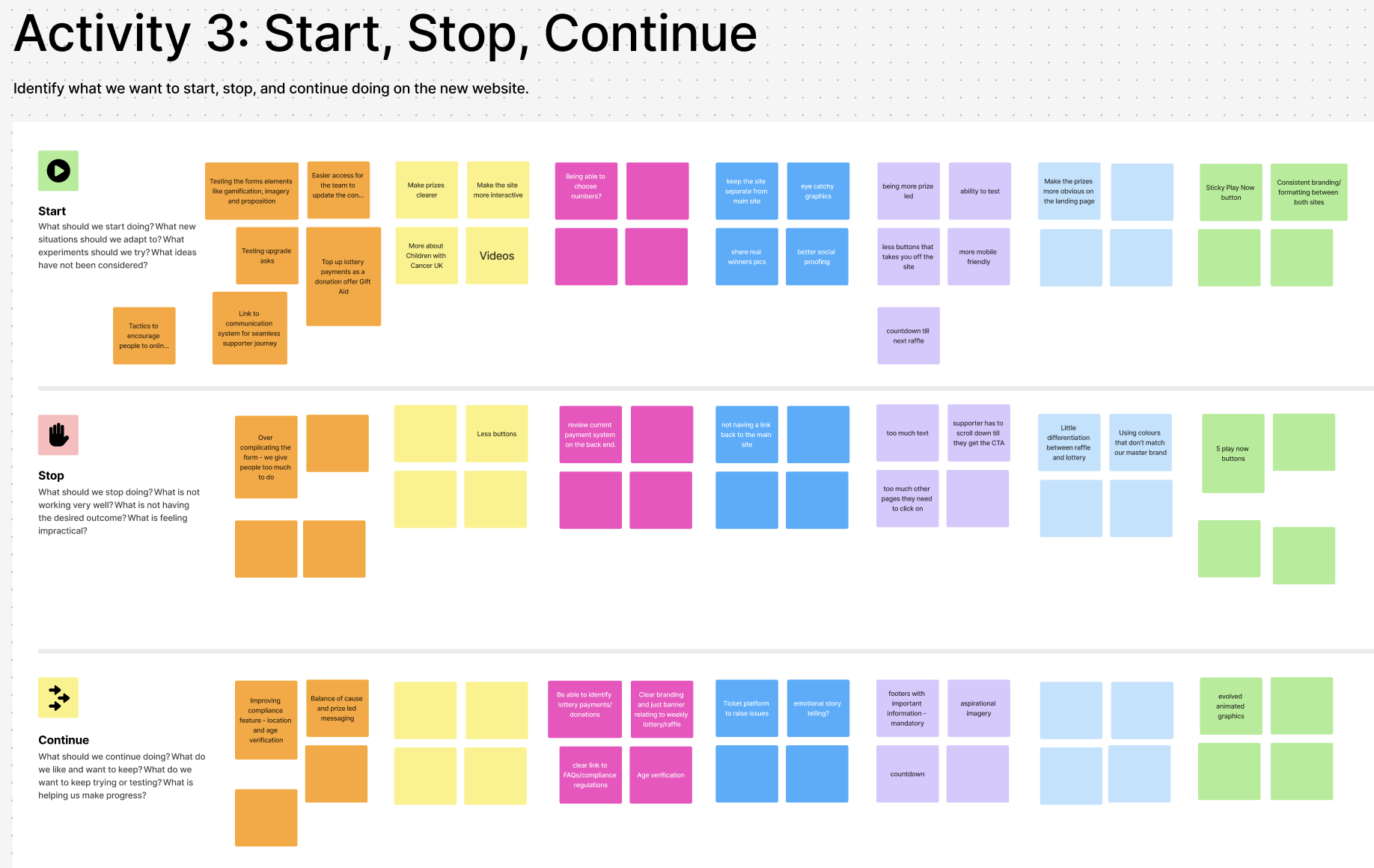
Who, what, why
Who visits, what they come to do, and what stops them entering.
Define success
Business goals and KPIs, one column per person.
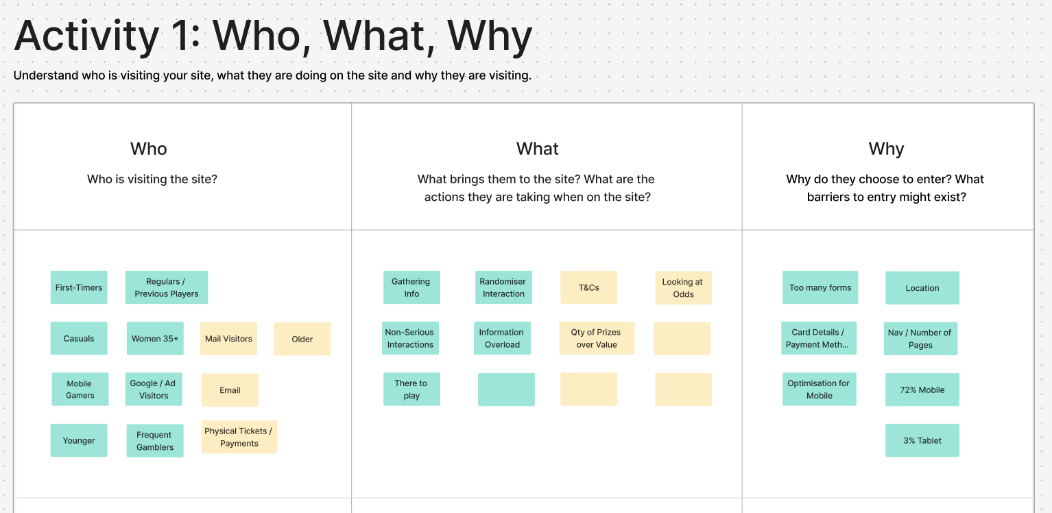
Start, stop, continue
What the new sites should start, stop and keep doing.
Competitor review
GOSH, Young Lives vs Cancer, NSPCC, Demelza and RSPCA.
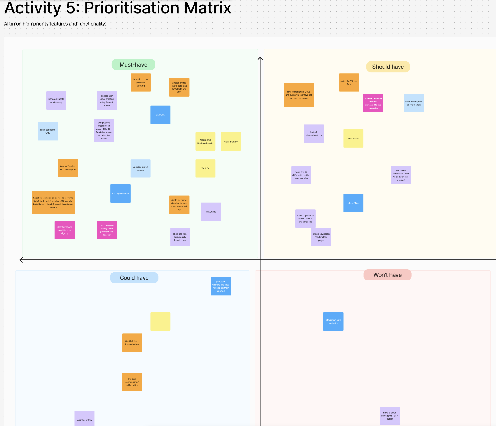
Prioritisation matrix
Must, should, could and won't have.
What the board decided
From sticky notes to the entry screen
I turned the boards into an action plan, and most of it is on the live sites. One thing the board asked for didn't make it.
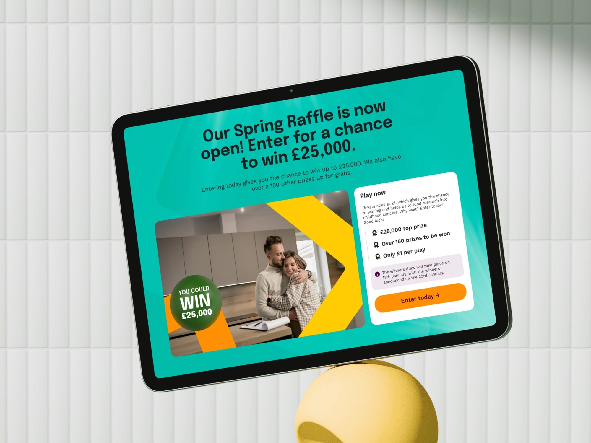
Prizes and price first
Players compare a charity raffle with commercial ones. Make the prizes clearer and get people to the button with less text.
The raffle card leads with a £25,000 top prize, over 150 prizes and £1 a play.
Rules before the button
Terms, age checks and draw dates came up in every activity, as a legal must and as a trust signal.
When the draw happens and when winners are told sits in a panel above Enter today, not after it.
A site of their own
Keep the games apart from the main site, so players are not pulled off into other pages.
Separate lottery and raffle sites on the shared platform, with their own navigation.
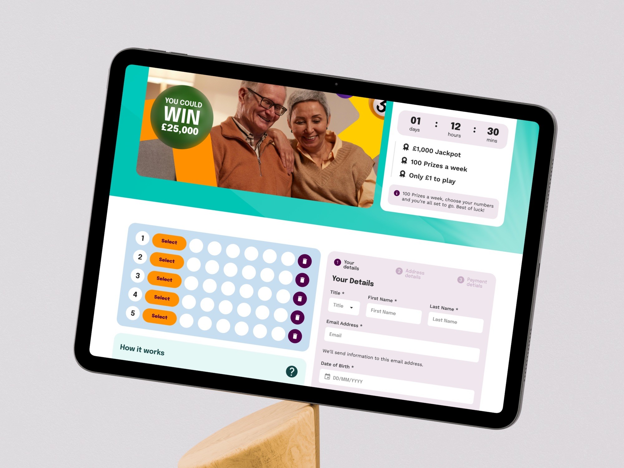
Fewer forms
Too many forms and card details were the biggest barrier, with 72% of visitors on a phone.
Numbers, details and payment on one entry screen, built for mobile first.
The odds
Looking at the odds was one of the reasons people came to the site at all.
Not done. The card says over 150 prizes, which sounds like a chance without being one.
The main site
What parents asked for
On the main site I spoke with five or six parents, introduced through the charity's family support team. At diagnosis they needed practical help the charity doesn't give, so the support section linked out to other charities. The support team asked for a Remembrance filter on stories, so a parent whose child is still in treatment never opens a bereavement story unprepared.
Next to the donate button, a pence-in-the-pound breakdown answered the donor's real question: where does it go? All three shipped in August 2025. The charity has changed the site since.


The shop
One supporter record behind three ways to give
A charity shop has a basket, a checkout and a delivery promise, and it still has to carry a brand built for a very different conversation. Run it as a separate product and you get a second set of patterns for the same buttons, and a supporter who exists twice in the database.
So the shop runs on the same component kit as the main site and the lottery and raffle sites, and feeds the same Salesforce record. Someone who buys a card in December and plays the raffle in March is one supporter to the charity.



Learnings
What I'd do differently
Give every participant their own colour. It shows when a shared priority came from one person.
State the odds. "Over 150 prizes" sounds like a chance without being one, and a children's charity's raffle should be the most transparent thing it runs.
Put the evidence next to the ask. A donor whose doubt is trust needs the breakdown beside the button, not on an About page.
Where it is now
Traffic up, targets still open
After launch the lottery and raffle sites drew far more visitors. In January 2026 I re-cut the audience by behaviour for the next phase: an event sign-up was worth £0.17 a session and a paid-search donor £4.04. That gap set four targets, and none has a reported result yet.
Traffic figures as published by Filter in 2025. They count visitors, not entries or income. The targets come from the January 2026 proposal.