carehome.co.uk
carehome.co.uk is a UK care home directory, paid for by the care homes it lists. As Lead Product Designer I designed its care advice pages and the pricing pages for care home operators, as Tomorrow's Guides moved three brands onto one platform.
The situation
Advice read on a bad day
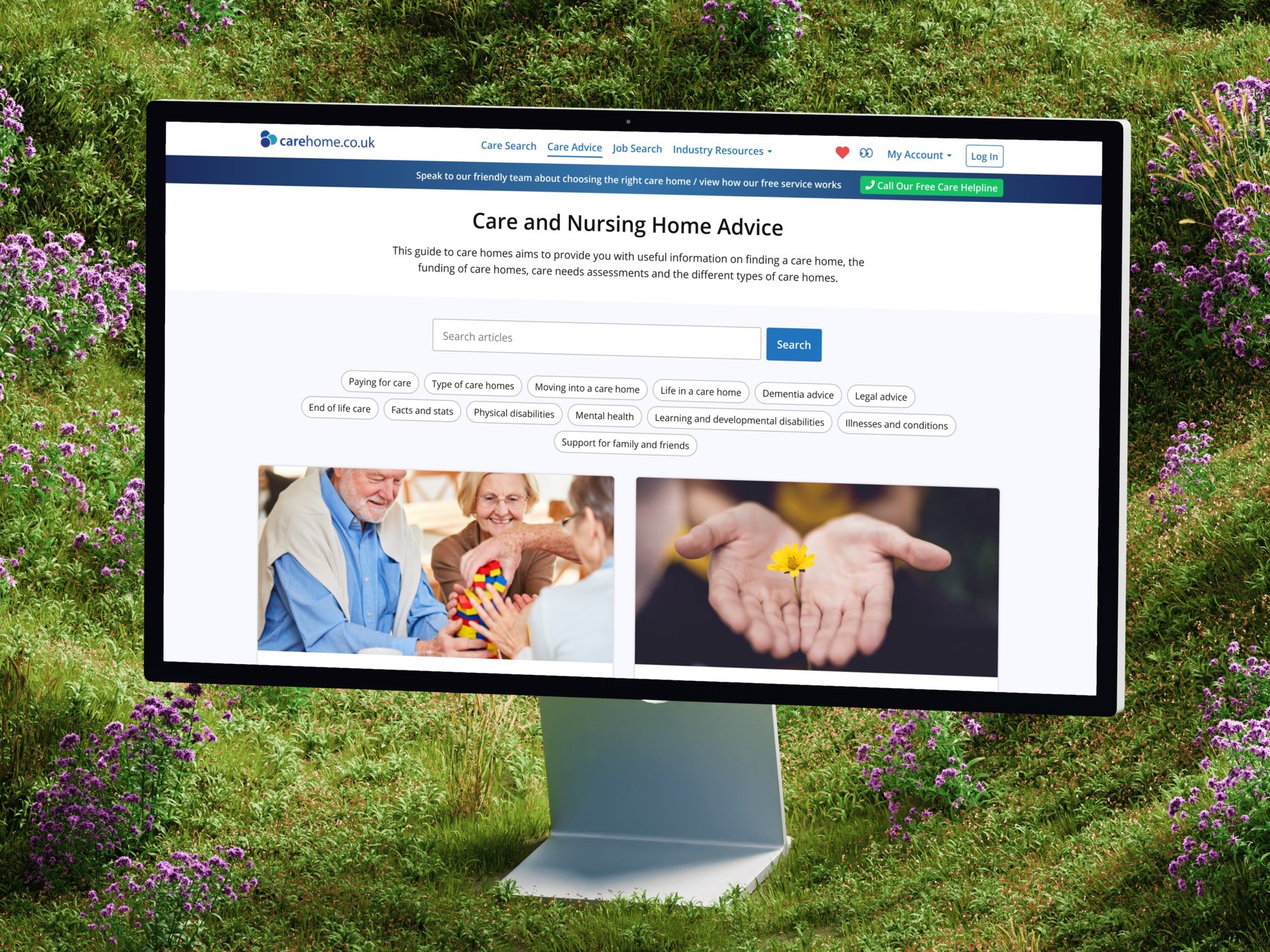
People reach the advice pages at a bad moment. A parent is coming out of hospital, or a dementia diagnosis has just landed, and most have never chosen a care home before.
Every home they go on to compare has paid to be listed. The advice has to be good enough to act on, and it has to look it, because someone who suspects the advice was bought won't act on it.
Discovery
Two teams who share the site
I started by interviewing the two teams who share the domain: sales, who sell listings to care home operators, and editorial, who write the advice families read. Neither team's knowledge was written down anywhere I could check.
Editorial couldn't publish without waiting for a platform release. I wrote that down as a requirement, and engineering answered it with a separate content system behind a reverse proxy.
Sales
What each tier gets an operator, what they ask on the third call, and what the add-ons really cost.
Editorial
How often they publish, what care advisors get asked, and which articles people reach from search.
Decision
The page says who wrote it
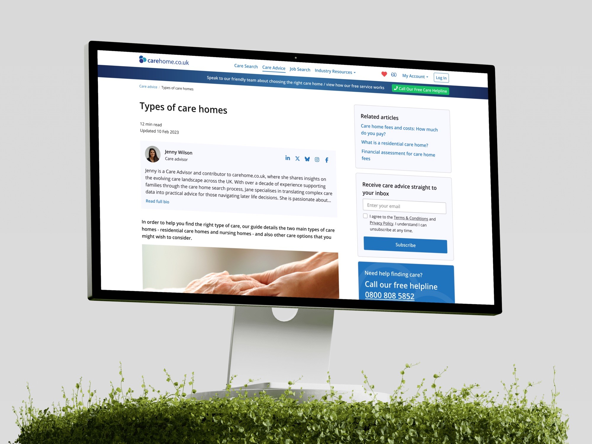
On a page about care funding or dementia, "who is telling me this?" is a fair question, so the article template answers it first: a named care advisor with a bio, then the reading time and the date the page was last updated, all above the first sentence. The free helpline sits in the header of every page.
The adverts pay for the free directory, so I placed their slots in the first diagram, before any layout existed. They sit beside the reading column or between whole sections, never inside a paragraph, and mobile carries fewer of them.
Operators
Prices on the page
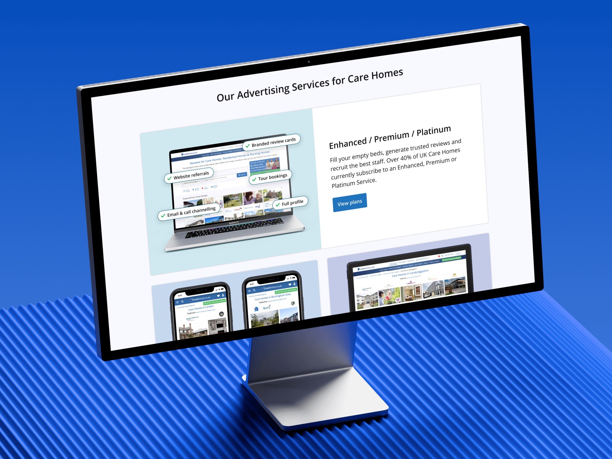
A care home operator who wanted to know what Enhanced gets them over Basic, or what an add-on costs, had to request a call. The pricing pages now answer that on the page: four tiers, each card reading "Everything in Enhanced, plus", a comparison grouped by job, and add-ons with their monthly price.
Sales worried that published prices would cut out their calls. The argument that worked was that the call moves later: an operator who already knows they want Premium is a better call than one who rings about pricing and hangs up at the answer.

Where it is now
Three brands on one platform
Tomorrow's Guides moved three brands onto one WordPress platform, and Filter reported no loss of search traffic, on a business that lives on search. Editorial now publishes without waiting on a platform release. The client's product manager said the team understood what they were trying to achieve from the start.