123Dentist
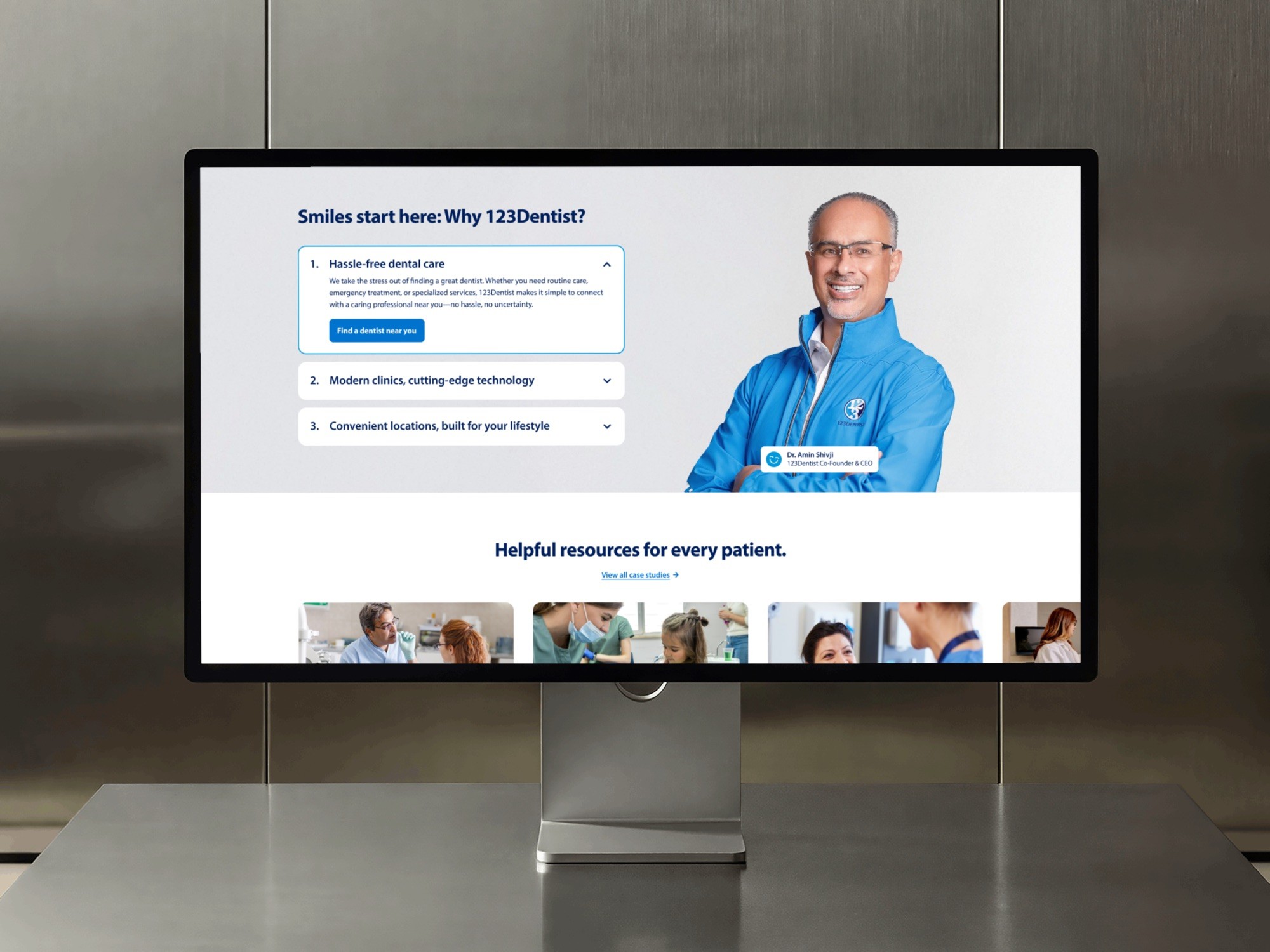
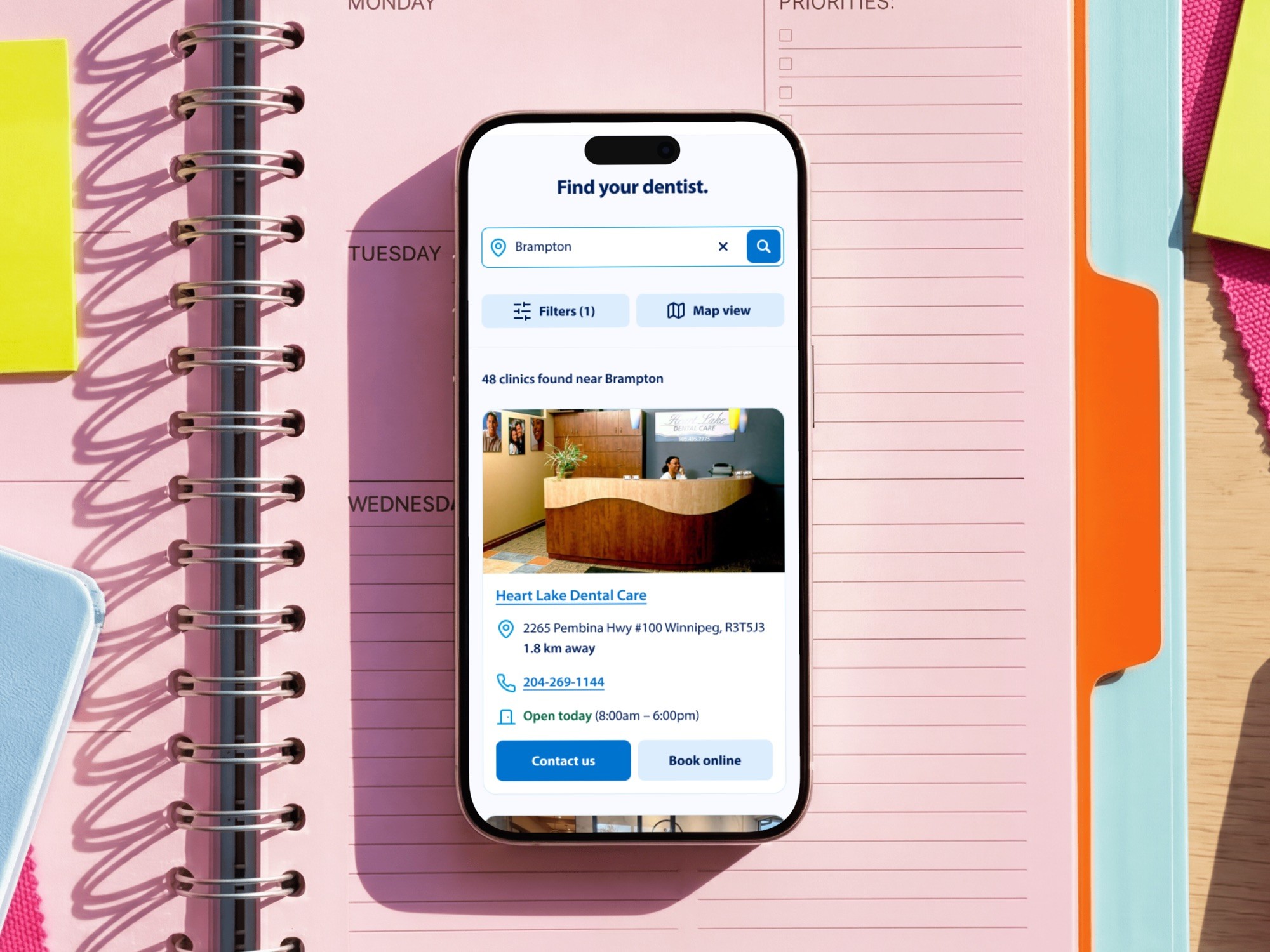
123Dentist is a network of dental clinics across Canada, and almost everything its English and French website does runs through the clinic finder. As Lead Product Designer I led the redesign, and tested it with patients before any of it was built.
The situation
Book online sent people somewhere else
The finder's booking button handed people to each clinic's own scheduler. It looked nothing like 123Dentist, and 123Dentist never found out what happened next.
The new site had a fixed date: live by the end of May 2025 for a marketing campaign, with a second phase in July.

Who uses the finder
Three people, one search box
A parent choosing a family dentist compares. Someone with toothache wants the nearest open clinic and a phone number. A dentist thinking of joining the network isn't a patient at all, so the partner route moved out of the finder and left it to the first two.
Compares clinics on services and hours. Distance is the tiebreak.
Wants the nearest clinic that is open, and a phone number to call.
Not a patient at all. Lands on the same pages to size up the network.
How I tested
Eight patients, three tasks, before build
123Dentist recruited eight of its patients. I ran each session over Zoom on the Figma prototype.
Moderating meant I could follow someone who did something unexpected. Testing before build meant every problem we found could still be fixed, because the launch date couldn't move.
Find a family dentist near you who takes new patients
As the parent
You have toothache now. Find somewhere open and call them
As the person in pain
Book a check-up for your child
As the parent
What the sessions found
Four findings, three of them about words
Three of the four problems were vocabulary, so the layout held up. The fourth was something missing that nobody on the project had noticed.
Service names
Patients couldn't match a chipped tooth or an ache to General, Cosmetic, Orthodontics or Restorative. They picked the wrong one or sorted by distance.
Rewritten in the words patients already use.
Book online
It dropped people on an unbranded scheduler, and some didn't notice they had left the site.
Taken off the card at launch, leaving Contact us and the phone number. It came back in phase two as booking inside the site, below Contact us.
CDCP
The chip was aimed at the people least likely to know the acronym.
Kept at launch as the client's shorthand. Spelled out in phase two everywhere except the mobile hero chip.
New patients
Nothing said whether a clinic was taking new patients, the first question for a family.
A filter for clinics known to be accepting. Clinics that never set the status still show, with a hedge on the card.
Decision
List first, map second, against my own spec
My proposal put the map on the left. With real clinic data in the cards, the list was the more useful column, and someone in pain shouldn't have to read a map before seeing a result.
It shipped with the list on the left, and the same pattern runs the province, service and search pages.

Scope
What waited for July
Booking and the French site moved to phase two. Booking depended on live availability across hundreds of clinics, the integration least under our control, and the May date wasn't moving. The MVP was built expecting French, so phase two switched it on.
- Clinic finder, list beside map
- Location guessed, and said out loud
- Filters for services, language and hours
- Accepting new patients filter
- Contact us and phone number on every card
- Opening hours for today on the card
- Booking inside the site
- French site
- Canadian Dental Care Plan spelled out
- New-patient badge on clinic profiles
- Languages spoken per clinic
- Ratings and review counts
Learnings
What I'd do differently
Put a self-assessment route in from the start. The competitor review flagged it and testing confirmed it, but by then relabelling was the affordable fix.
Test the words as well as the layout. Three of the four problems were vocabulary, and none would have shown up in a design review.
Leave the evidence with the client. Two research-led changes have since been reverted, and the session findings would have given whoever changed them a reason to pause.
Don't ship a thinner version of a feature that isn't ready. A booking button that hands you to a stranger spends trust the site hasn't earned yet.
Where it is now
Tested before launch, unmeasured after
Analytics and A/B testing were scoped for after launch and cut when the project moved to support, so I can't say what happened to bookings. The site has changed since handover too. The service filters use the clinics' own categories again and the new-patients filter has gone. The spelled-out care plan and booking inside the site are still there.